Smart Home
UI Design and User Experience
How everything began
Everything began when an order came to us for a “dream project”.
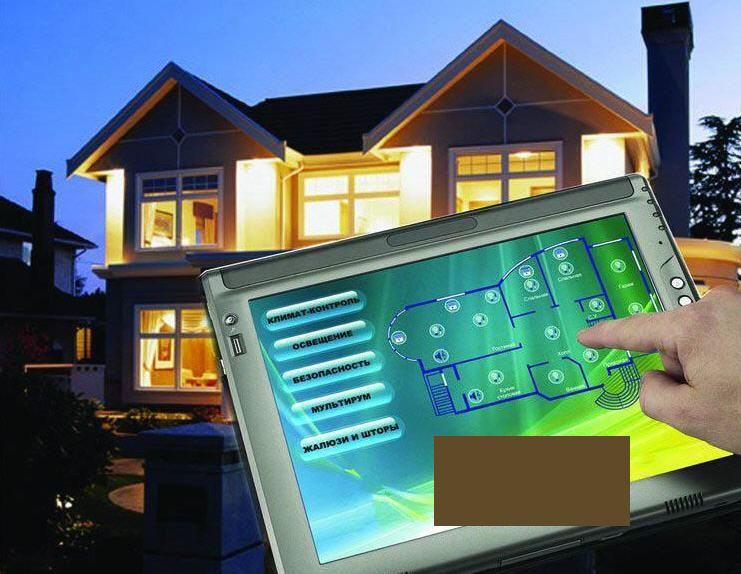
The order sounded short and simple: change the UI technical system of a smart home.
Looking at this system, it was clear to see a typical representation of a smart house of which there are many today, here it in an old design.
Namely: boring icons taken from internet sites, not well thought out screens, non ergonomic use of space small resolution, glamorous gradient buttons, and sensors included on the plan of the floors as received the programmer.
But the architecture of the project represents a competent decision by us. There were server management sensors and analysis of the data, representing a small box, to which you can connect three ways:
From a home computer through a browser (as a router) to the administrative interface – for adjusting anything and everything.
From the touch panel at the entrance to the house – for management alarm , scripting, cameras and sensors (this is we why we were suggestid to begin the project).
From mobile devices – for home control from anywhere (in the first version through the same admin panel).
After talking with the customer, it was decided to make the interface in the style of Windows 8, although it had not been released yet , there were only numerous screenshots in the network. Not going into the details of this decision, I would only say, that it was accepted unanimously and we started work.
It is worth mentioning that by this time we had some experience in designing very similar interfaces: the control panel for yachts (they are worthy of separate articles,but there are strict NDA), on-board computes for cars and a few touch-screen kiosks.
Idea
The theme of designing a system for a smart home has excited my imagination for a long time . Solutions that exist on the market don’t even come anywhere close to what I would call “smart.”
Consider this example:
It became dark. You need to turn on the light in the room. Your actions?
As usually happens – you get up and turn on the light.
In versions of many developers of automation systems – you take the remote control and turn on the light.
Here they often don’t see everyday problems. First, the remote control may not be close, it’s necessary to stand up to find it, and secondly, don’t forget that most of these devices are now with a touch screen, it means that the remote control also needs to include one. The latest fashion – is to make remote controls with tablet or phone (a separate application), which further complicates the problem:
Get up and find the device -> Enable or unlock the screen ->launch the application -> Find the right sensor -> Why would you do this?
Would it not be easier to get up and turn on the switch?
The smart home in my mind – itself should turn on the light when you need it, and at the same time take into account whether you are be awake or relaxing, the season, the number of people in the room, your location in the room and a lot of factors, based on your previous decisions in similar situations foreseeing your desires.
Otherwise this house can hardly be called “smart”.
A remote control – should only be used in special cases and should not be the mainstay of home control. A truly, “smart” home doesn’t need you to control it – it will do everything itself.
But the road to such systems still far, we can say that today it is impossible to implement, so we will improve what we can, namely, the same remote control.
The main solutions to the problem is easily shown in pictures as you can see bellow:
Yes, almost all such systems - are in the form of a remote control for a nuclear reactor, where, even for advanced users it is sometimes hard to understand.
For some reason developers try to put so many elements on the screen to give so many options and as a consequence, they create so many problems UX.
So what’s the idea?
Remove from sight everything that isn’t necessary, absolutely everything.
If I just want to turn off the lights in the bedroom, why do I need to see sensors that control water valves in the kitchen?
If I want to close all the windows in the house, I want to do it with one button instead of poking each sensor individually.
If no-one is in the house and I set the alarm – then all the lights should go out, the temperature is lowered, the windows are closed, and video surveillance is enabled. And all of this should happen without my participation!
One ring to rule them all. One button – “It’s perfect”.
The best interface is one that – you do not see, that you don’t even notice during operation, which does everything for you, or actually you manage it on a subconscious level, because:
You are so accustomed to it.
This are obvious.
Do you pay attention to where is the Play button is on Youtube? Where the close button is that closes the browser’s window? Or where the search box on Google is?And will you go into a stupor because of a hundred sensors on one screen of a smart home?
It is true, all that is actually required by such systems – is to solve one specific task (such as Play in the player or Find in search). No need to display all possible controls on the screen.
Not an easy task indeed.
The first prototype
We had this vision from a customer:
We looked, thought, and we used the only one of these materials , the specification sensors and commands (scripts of the User)
We took onboard a few points:
In the touch panel there was no support for Multi Touch and it has a resolution of 1024×768 and 1024×600
The Metro interface was new and it was not possible to touch this on the tablets (Windows 8 had still not been released). Although we had a phone on WP7, which gave some insight.
The customer could not change some points in the system (material restrictions, the rise in price of the system, personal desire, etc)
In general, the design of these screens as the main menu, video surveillance and intercom, weather overboard, notifications of the systems and etc – was made without any problems, and so there is no reason to talk about it, it was version 1, the future will be more interesting.
The only problem was with the main control screen sensors. I will write about it.
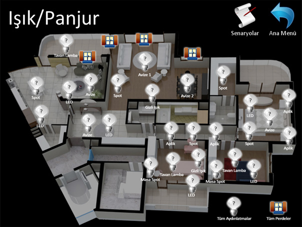
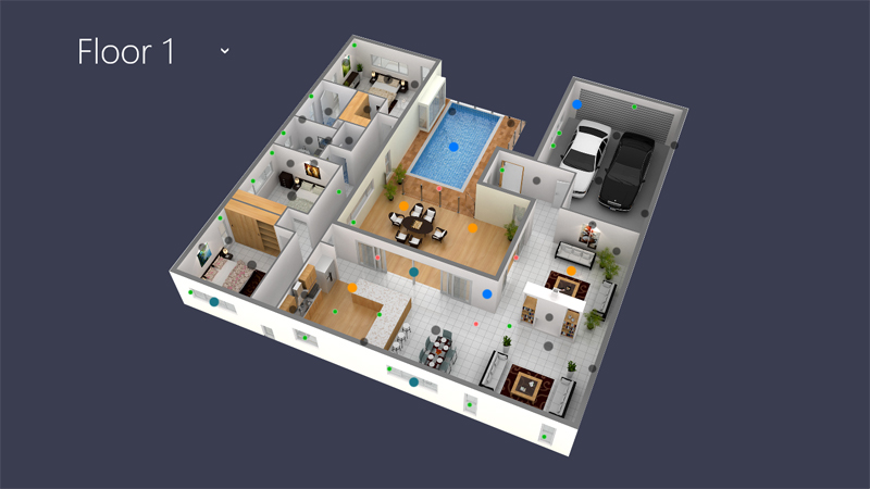
A plan of a house
Here’s a picture of a typical screen management sensor with a plan of a house taken from the Internet:
Tell me, how many of you understand what is depicted on this plan?
And would your child understand this plan? And your grandmother? Or a friend who visited for tea, orient?
I think the problem is clear.
The plan should be read easily by everybody. To do this, it should precisely show your house, with the color of your walls and your basic furniture:
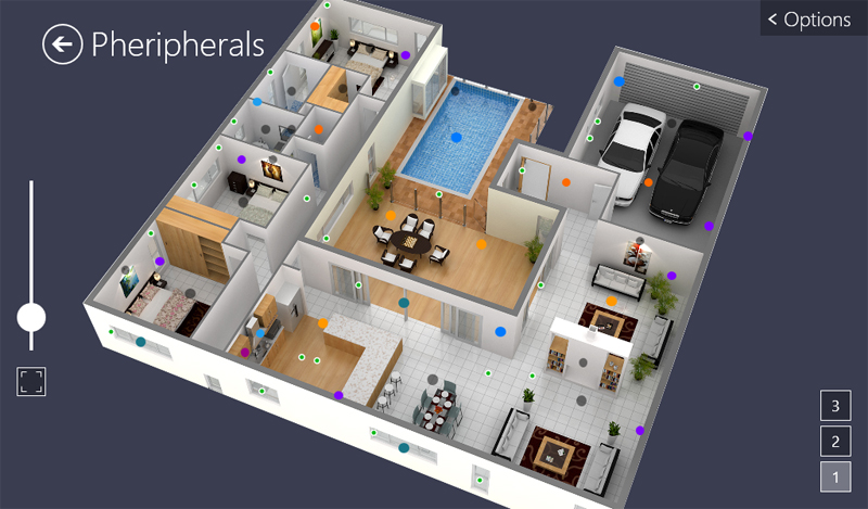
And ideally, the plan must always be positioned relative to the coordinates.
This solution is more expensive, and rearranging the furniture will mean that the plan is not accurate, but here anyway – there is compromise.However, nothing prevents the inclusion in the draft of any plan either with or without it (we allowed for both).
Incidentally, in the first versions of the premium class we wanted to make a 3D plan , but it is a much more expensive solution, and it is unnecessary for now, maybe it’s enough that it is for the future.
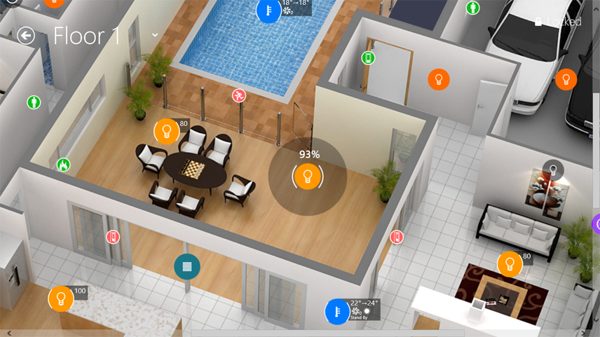
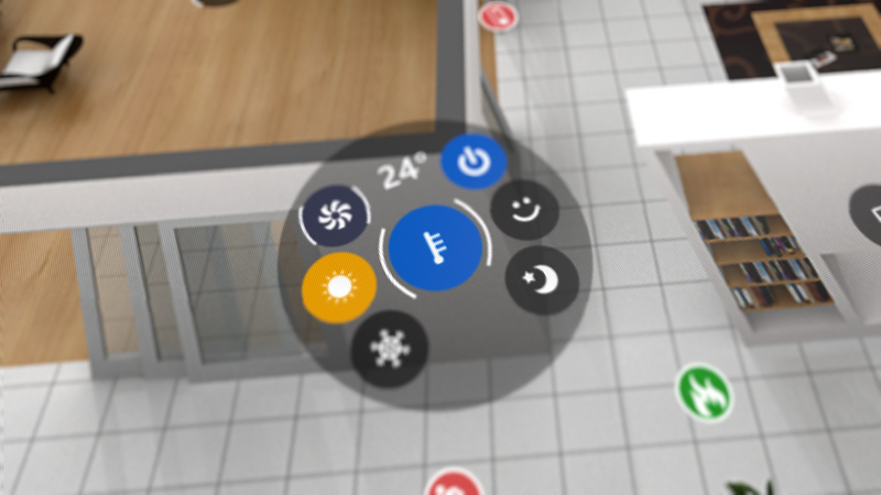
The sensors
The biggest problem – the visual representation of the management of sensors on the plan was overcome faster than expected. As I remember, we were sitting with the designer and drew on some paper WireFrames for future systems, and the decision came by itself:
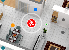
The sensors that are simply there to show something – are not visible, and it will only flash when there is something wrong (fire, breakage, breaking into a house, and so forth). At the same time in the house the signal triggers an alarm.
The sensors such as “On. / Off.” – Circles with the icons with the different colours depending on the type are adjusted for the size of the finger.
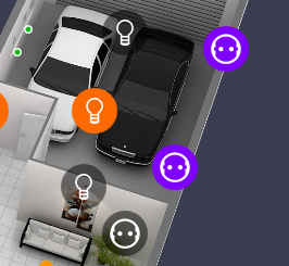
The sensors of the “dimmer” are multi-position and use many combinations – here is the most interesting part, they are the same as the previous ones, with the only difference being that they have a labelsshowing where you can touch the screen. When the sensor is activated (it pops up on the control panel and shows informations) and the animated tags are displayed, showing that it is possible to turn it.
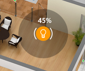
A decision, such as changing the setting can be done without activating the sensor by means of a seperate touch. Making gestures on the sensor shows a lot of information about variations in value, which is later converted to a small number near the sensor.
Below I attached a video where you can see how it works.
One button
“Well, where’s the one button?” – You ask.
And here it is:
“One button” – this is a conventionality by this I mean one function – this is most important and I recommend that this is key from the outset.
We have small resolution, showing the colorful plan with a lot of sensors – what we don’t want is a bad idea.
It’s worth remembering that I describe the creation of a fixed console version of the remote control (this is a monitor mounted into the wall).
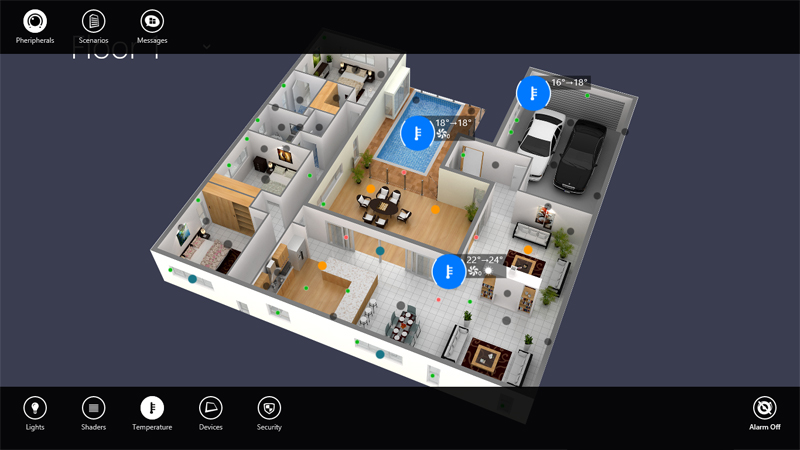
The main scenarios showing typical usage of this panel are:
A person opens the front door -> the panel is activated and warns us that we need to turn off the alarm system ->the password is entered -> the scenarios is activated as defined for that home.
The same when we leave the house – we put on the alarm system.
If someone rings the doorbell – we see who’s there, over the intercom, which is displayed on the top of any screen when the call is made from the street and then we open the door.
Activation of the user scenarios – for example, the scenario at night, when the doors and windows are locked, the video surveillance is activated, the temperature is reduced , etc.
Managing individual sensors from this panel is not very convenient (well, judge for yourself, would you adjust the brightness of the light in the bedroom, while you are in the corridor?)
The management is possible if the panels are embedded all over the house.
But according to the customer, this function really must be included.
Decision
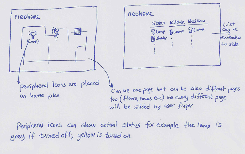
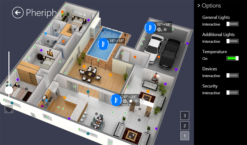
Upon entering to the screen, the user sees only the house plan. Sensors can be seen as a very small dots (to show where they all are.)
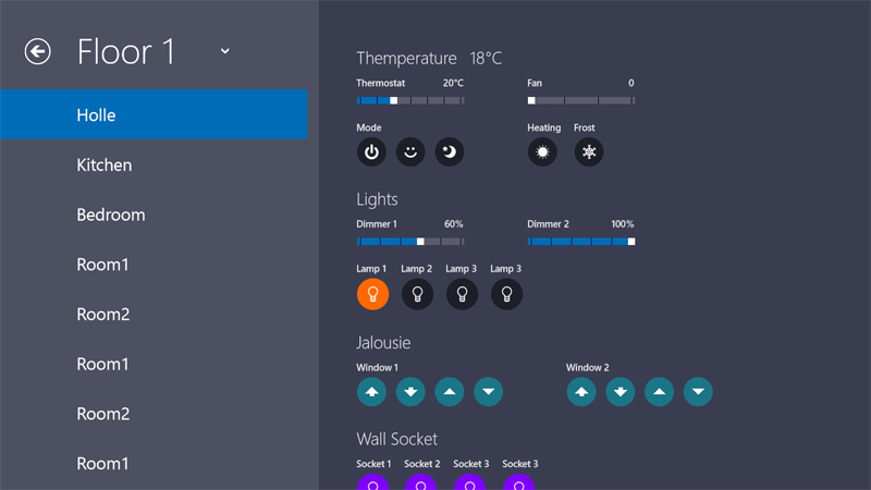
Besides being able to switch the floors, the user has 2 options
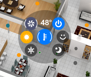
1. Activate the options panel that allows, for example, to display all the thermostats in the house on the plan and adjust the temperature as not envisaged by the scenarios, or, for example, to activate the sockets in the garage:
2. Enlarge the plan. The larger we increase it – the more the sensors are converted from a small dot in the full management control, and the sensors appear in priority order. Thus, without cluttering the space:
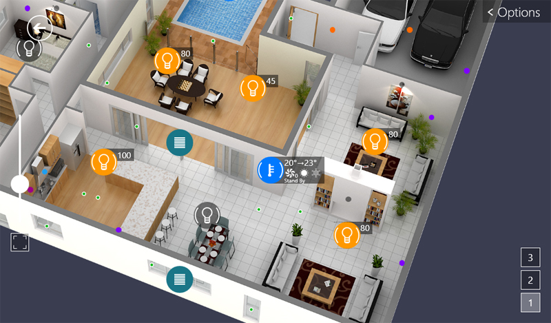
That is the user always sees only what he needs.
Integration
The customer’s decision was to use WPF, and the integration of the design in XAML, this is my main specialization. So we not only “painted the pictures”, but also to implemented the design in practice.
About how we made the controls and XAML, and about how we animated everything and tied it to the home’s plan, can be written in another complete article, but the less competitors know, the valuable we are as professionals. Here there is not much point in describing the decision of the usual remote control. Since we then focus on the tablet version.
Whoever is interested not only in the screen control sensors, but also everything else can see the final result in pictures
Or in the video:
In total, the design took us about 5 months to do in the demo application, and its
implementation went further with the customer’s programmers directly combining the
hardware and software.
And, as usually happens, when finishing the project – you always want to remake it, because you already see how to make it better, the shortcomings and the weak spots, and here there were many weak spots.
While I was doing XAML, a Windows developer preview was released, and I immediately rushed to used it on the desktop and on my tablet (Aser Iconia W500). The official Guidlines also came out , which allowed us to look at the Metro UI in new ways.
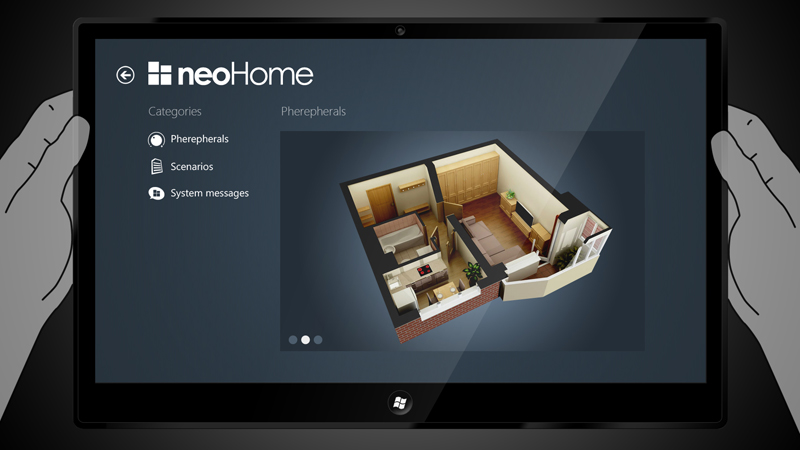
Part 2. UWP app
Everything that we have done – garbage
The customer was very pleased especially when we presented a working demo. I could say that his happiness knew no bounds. I saw the shortcomings of the project, but at the same time I knew that to bring perfection, is only possible by putting in a lot of time and only with a team of good programmers, but it did not matter at this stage of the product development.
The customer, like me, watched the new Windows 8, and we both thought it was very good. Therefore to my suggestion: “Let’s make a version for the tablet?” he reacted very positively. I suggested not to change the embedded in wall system, because it does not support MultiTouch, as it does in Windows 8, therefore it makes no sense to put it there. We left the redesign until better times, focusing on the Metro / Windows store application (namely the Metro, because it will distribute a demo in store for attracting customers).
Unfortunately, the budget of the customer was limited, but I agreed to carry on the work. Essentially we made the version for Windows 8 free. Partly it was necessary, we had a very good job in the portfolio before the release of Windows 8.
Second prototype
After a couple of weeks my designer gave me his vision of a tablet version of the product:
I was a little upset, the design was far from what was needed, I tried to explain the errors, but you can’t learn to swim without getting into the water, the designer could not give me what I wanted, because at that time he had too little experience with Windows 8/10.
Therefore it was decided to remake everything, and to work on the design together with me, doing it all at once in XAML.
This will solve the skills shortage problem for the Guidelines of the designer, and to me, as a developer, it will not spoil the picture.
Design V2 and the simultaneous integration
Honestly, it was pretty damn hard. I was ready to kill the developers of Blend 5, because compared with the 4th version, it was a buggy, unusable, constantly interrupted program. Now the situation is better, but sometimes it is not.
I was saved by VS 2012, it included a partially functional of Blend for managing styles.
New XAML - this is a topic for separate conversation,there were not half of the old classes included, the default styles are worthless, triggers were removed -leaving something unpleasant in the visual states. As well as having to rewrite the project from scratch, when Windows 8 was updated to Relize Preview, but those changes were for the better.
A new concept
The new device – a new approach. The idea of a starting screen had to be revised, now it was not necessary, and all navigation is moved into the upper AppBar.
Do away with all the buttons on the screen: Zoom -by motioning, we have the same full MultiTouch, all control sensors – in the lower AppBar.
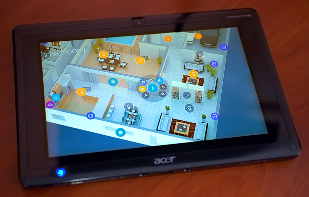
Now the application will start immediately showing the house plan (ideally it should track in which room the user is located and immediately increasing the room a little on the plan, and positioning it in the centre).
Open the application:
Making a motion to Zoom (or CTRL + mouse wheel):
Or get App Bar:
Controls
The control sensor’s functions had to be rewritten from scratch and make them with natural movements with support for control movements for Windows 8/10.
It was taken into account that we now have a possible 2 way management system, by fingers and by mouse.
So the appearance of sensors were improved, and became more stylish:
I was particularly struck by the speed of application performance. The performance in Windows 8 applications are by orders of magnitude higher than WPF. I was afraid that the tablet would not master the system, but it was working. Microsoft surpassed themselves, now it doesn’t matter how complex XAML, it should work fast. In WPF if you had to make self-made caching algorithms of screens for quick animation, think about the complexity of branching XAML, to optimize the number of elements in the tree control, that in Windows 8, just does not matter, any complexity of animation and any number of objects is always smooth.
Version without a plan
Here there was no need for sensors with touch support, there was no need to save space. It certainly turned out not so spectacular, but good.
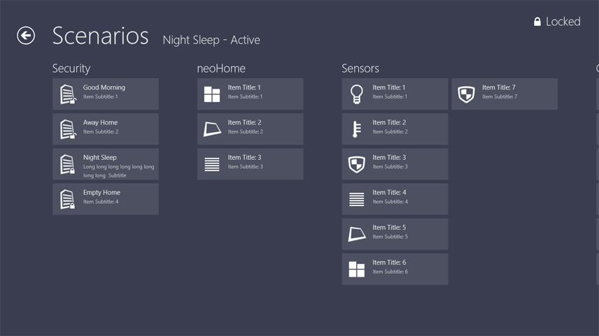
Scenarios
Management of sensors, is of course certainly good, but as I mentioned earlier, the basic operations with it are better automated.
For this in the administrative interface there are basic preset scenarios and the ability to one’s own scenarios.
On the tablet, it looks like this:
One button
From the outset we did not depart from this concept.
They often asked the question: “Why does the job take half a year?”
And I take this as praise. This means I have achieved everything – that I wanted. The user simply does not see that the functionality of the application – quite large, because what is seen is just what you need at that moment. The data itself and the necessary screens are displayed for the user, and the user is not looking for it. The interface is clean from the first minute, there are not a frightening abundance of buttons and at the same time any action is performed as simple as “one – two – three.”
To create versions only for Windows 8 took 3 months (taking into account developments in the first version from scratch would take more).
By the way. Have you noticed that everywhere in Windows, such as PopUps – there is always one. Everything we have openeding is in pop-up form – always just one, if you open another –the previous will close. I had trouble in the interface: after activation the sensor closed itself after a certain time, but if you activated one, and then immediately another – they were both open, and it does not look very aesthetically pleasing and clear. Thanks to my second designer for this feedback. He was not directly involved in the project, but some things are implemented thanks to him.
For one week I was struggling to solve this problem.
And I solved it …
One line of code.
Moral: sometimes the simplest solutions are hiding behind a lot of work.
Feedback from Microsoft
Last spring, Microsoft ran a campaign, where all developers could get free advice on improving the UI / UX of their products. And we had time on our hands.
To be honest, I was afraid that they would smash everything to smithereens, because it was my first experience of Windows 8. But everything went smoothly, according to the customer, Microsoft really appreciated the quality of the application. We got a few small recommendations to improve usability (by the way very good) for example that:
There were true comments, and take note. If we select an object and then the possible the actions with them – the AppBar should open itself, showing the user these possible actions.
In general the problem is much wider, and expressed as such – the obvious actions should be made by itself, and no need to wait for the user to do them.
I made all amendments in less than a day. And my heart was warm and calm.
In total
At present the system is still under development, the customer’s do not work as good as we would like. Therefore, I’m writing a post after almost a year, and the release date is unknown now.
The application can be accessed from the Windows Store to those who have Windows 8, but before that you need to put in the settings the Turkish language
But now in the Windows Store is a stripped-down version of our application, demonstrating the main features. Someday the system will be complete, and since we reworked the old system – the probability of it is great. Hopefully, the customer’s business will get over the hill and we will continue to work on the project. And there is still a lot of work to do there: a web version, a website, a corporate style (we have developed a logo and I have now a altered its idea a little, but it needs to develop further), last summer we finished a version for iOS, Android, WP8. And the version for Windows 8, since then a lot changed in Windows, and my skills in this area have grown.
And finally, the video about Windows 8/10 version (Look HD):
I will be glad to your UI design orders.
Good luck!
-
 Miniature oscilloscope
 -
 Medical Laser
-

-
Moscow, Russia